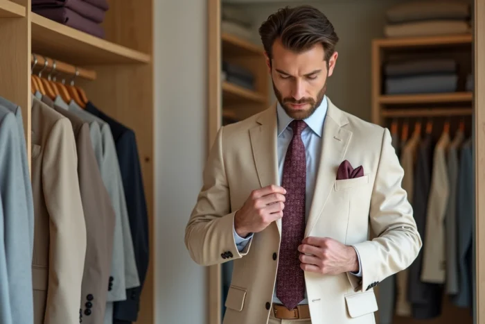
The beige suit raises a style question that few other shades provoke with such acuity: that of the balance between the softness of the base and the intensity of the accessory. Where a navy or charcoal suit can absorb almost any tie, beige reacts like a developer. A poor choice of tone or saturation, and the silhouette loses its coherence. This observation, shared by tailors and specialized content creators, deserves a methodical approach.
Why beige reacts poorly to overly dark ties
The uniqueness of the beige suit lies in its low chromatic density. It reflects light instead of absorbing it, giving each accessory increased visibility. A deep black or very saturated midnight blue tie creates a harsh contrast that, in photos as well as in person, visually overwhelms the light beige.
Fashion content creators, particularly on Instagram and TikTok, have noted since 2024 that this trap hits particularly hard at weddings, where the beige suit is increasingly worn. Their feedback converges: dark accessories create a “stain” effect in photos, whereas softer tones integrate harmoniously with the silhouette.
To choose the right tie for a beige suit, one must think in terms of tonal proximity rather than maximum contrast. Beige calls for colors that converse with it without dominating.
Tie for beige suit: preferred smoky tones
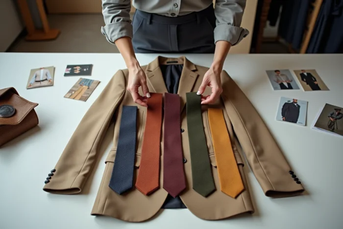
The category of “smoky tones” includes moderately saturated colors, slightly grayish or earthy, that share the natural warmth of beige without competing with it. Four shades stand out in recent recommendations from men’s style communities.
- Olive green: described as a “contemporary and organic” harmony with sandy beige, olive green adds depth without harshness. It works well in both smooth silk and cotton knit.
- Terracotta: this shade, highly promoted since 2023 in men’s elegance groups, particularly suits warm complexions. However, it remains absent from most general tie guides.
- Muted Bordeaux: to be distinguished from pure bordeaux, which is too intense. The slightly faded or “smoky” version retains the character of red without the aggressiveness. A reliable choice for formal contexts.
- Tobacco brown: the closest to beige on the color wheel, it creates a subtle monochromatic effect. The risk here is monotony, which can be compensated with a different texture (wool, linen) or a subtle pattern.
These four colors share a common point: they all contain a hint of brown or gray that ties them to the beige family. The result is a silhouette that appears to be thought out as a whole, not as an assembly.
The question of saturation
A bright olive green and a smoky olive green do not produce the same effect on a beige suit at all. Saturation matters as much as the hue itself. The lighter the beige of the suit, the more the tie benefits from staying in medium tones, neither too bright nor too muted.
Field feedback diverges on this point for dark beiges, close to camel: some wearers successfully pair them with more saturated ties (cobalt blue, forest green), while others prefer to stay within earthy tones. The wearer’s complexion and the lighting of the context (indoor, outdoor, photo) strongly influence the result.
Tie material and beige suit: what the fabric changes
The beige suit, especially in its summer versions in linen or cotton, has a visible texture. A very shiny silk tie may then seem incongruous, like an element borrowed from another outfit.
Matching the texture of the tie to that of the suit creates a much more coherent effect. A linen beige suit calls for a linen or cotton tie. A light wool beige suit pairs better with a wool tie, silk grenadine, or matte silk.
This logic of textile coherence is rarely addressed in color guides, which focus on hues without mentioning that two ties of the same color in different materials radically change the look of a beige suit.
Patterns and stripes on a beige background
The solid beige suit, which represents the majority of cases, tolerates discreet patterned ties well. Fine stripes (regimental type) work if they incorporate one of the smoky shades mentioned above. Dots, on the other hand, require a smaller size to avoid veering into too casual a territory.
A patterned beige suit (Prince of Wales, herringbone) demands a solid tie. Layering two patterns on such a light base creates a visual noise that darker shades would mask, but that beige amplifies.

Pocket square and tie with beige suit: coordinate without duplicating
The pocket square accompanies the tie without replicating it. On a beige suit, this rule takes on particular importance, as the light base highlights each accessory equally.
A white or cream pocket square remains the safest choice: it extends the brightness of the beige without competing with the tie. If the tie is olive green, a pocket square that picks up a lighter shade of green or an off-white is enough to create the link.
Avoid matching the pocket square exactly to the tie, especially with a beige suit. This overly visible “matching” gives an impression of a pre-packaged set that contradicts the very idea of a personal choice.
The beige suit forgives little in terms of accessory mistakes but generously rewards thoughtful choices. An olive green, terracotta, or muted bordeaux, in a material consistent with the suit’s fabric, is enough to transform a decent outfit into a controlled silhouette. The rest is a matter of context, light, and what the wearer wants to convey about themselves without saying a word.